ShopDreamUp AI ArtDreamUp

Deviation Actions


Description
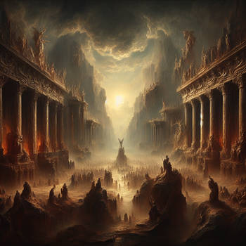
Tried with entirely different technique, I believe I'm getting closer to how I want to use colors and lighting. It has been a very useful, learning experience for me. I really enjoyed doing it. ")
Most of the time I used one layer and stayed away from fancy effects in photoshop (I always want to force myself to learn how to do it the traditional way so I can do it in oil painting in the future without having problems), there were some points I did some *minor* adjustment and had to use overlay to fix a bit without losing details, but that was used sparingly and was for to tweak color that was possible by "glazing", but the dark details part would be lost... so") multiply and overlay effect becomes useful for that (too lazy to redo the details lol). Otherwise, it is close to the original coloring I had in beginning. Not bad eh.. enough of rambling.. sorry...
multiply and overlay effect becomes useful for that (too lazy to redo the details lol). Otherwise, it is close to the original coloring I had in beginning. Not bad eh.. enough of rambling.. sorry...
Enjoy this piece! All colors are used for this piece, it's full of meaning.  (Wink)") I didn't make it that moody for nothing.
I didn't make it that moody for nothing.
Most of the time I used one layer and stayed away from fancy effects in photoshop (I always want to force myself to learn how to do it the traditional way so I can do it in oil painting in the future without having problems), there were some points I did some *minor* adjustment and had to use overlay to fix a bit without losing details, but that was used sparingly and was for to tweak color that was possible by "glazing", but the dark details part would be lost... so
Enjoy this piece!
Image size
1000x750px 423.37 KB
© 2009 - 2024 DM7
Comments32
Join the community to add your comment. Already a deviant? Log In
love the colors and images